Dr. Martens
Branding, Packaging, and Web Design
Client: Dr. Martens
Final Major Project
The Brief
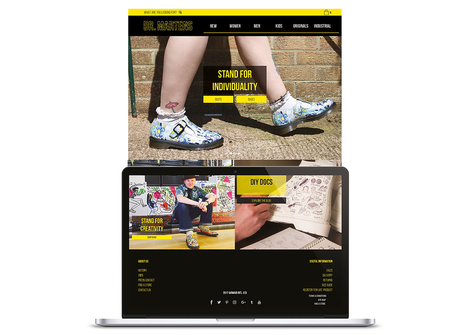
To re-brand Dr. Martens in order to give them a more modern aesthetic, appealing to new and old customers. Create a new interactive website and packaging that reflects the core of Dr. Martens in it’s simplest form.
Solution
When undertaking research I came to the conclusion that
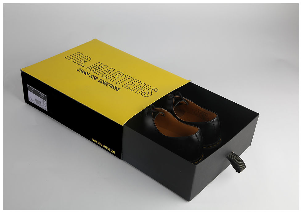
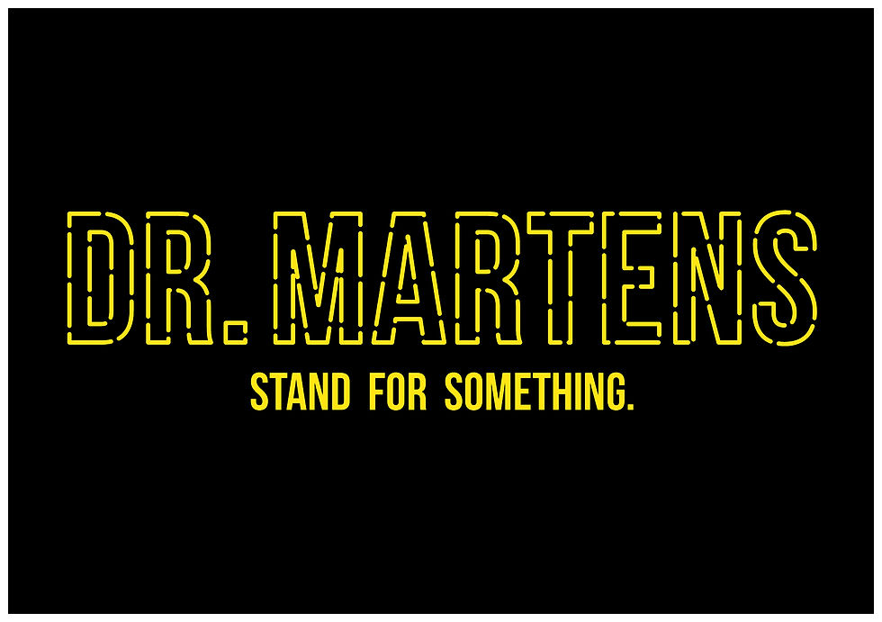
their current branding was outdated and very busy. My design was using the trademark of the shoes - the yellow stitching, so I
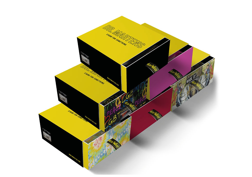
used that to make the logo type. The shoe boxes can be kept
as storage, and they’re also easier for stock rooms when
looking for a particular pattern or colour. The pull tag is iconic for Dr. Martens’ boots, which is a subtle touch to the box. I applied the design across a website design, stationery, and promotional items.